So, my hometown wants a new flag to replace the banner of arms which currently represents us. The six finalists are all ugly. Why don't you decide which is the least ugly?
A
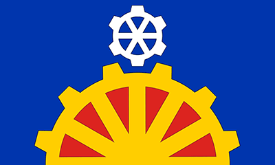 The design is inspired by important Industrial Revolution invention of the sun and planet gear system invented by William Murdock for Boulton & Watt. A large golden cog issues from the base of the flag, with spokes like sunbeams representing sunrise and the dawn of the industrial era. A smaller white cog above this continues the allusion to the gear system, the white colour representing the moon which in turn recalls the Lunar Society of leading national industrial and scientific figures of the industrial revolution that met in the city. The blue and red colours are drawn from the heraldic colours of the de Birmingham family and city council, here they also complete the imagery of a sunrise. Furthermore yellow represents the movement of the wheel of industry, red the heat of manufacturing and blue for the canals.
B
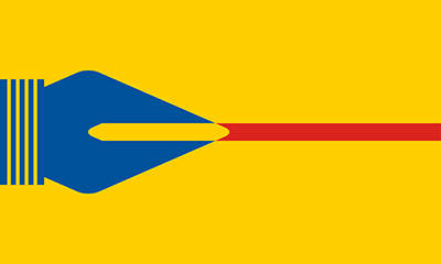 Issuing from the hoist is a blue steel pen nib for which Birmingham was the centre of world manufacture in the Jewellery Quarter and the precision industries of the city. The lines at its base also recalling the tyre and automotive industrial heritage of the city. The straight red line that the nib draws denotes the man-made canal network that spans across the city carrying the lifeblood trade and industry. Together the pen and ink are an allusion to Birmingham's proud literary and arts heritage. The colour scheme drawn from the heraldic colours of the de Birmingham family and city council.
C
 From the hoist issue two triangles, which together act as an abstract representation of the letter B, recalling the name of the city. This is bordered by a golden zig-zag shape, similarly forming an abstract vertical letter M. This symbolises the Roman letter for 1000 and in turn Birmingham's sobriquet as 'the City of a thousand trades'. The overall arrangement of the zig-zag and colours serves to represent the historic arms of the de Birmingham family and current city council. In the centre of the design is charged a golden bull's head for the Bull Ring market which stands at the geographic, economic and historic heart of the city.
D

The over-layered golden cross and saltire reflect the city's central position, links and reach within the nation and how its rise powered the rise of the country. The crosses are bordered by the alternating red and blue of the historic arms of the de Birmingham family and current city council, whilst the golden call recalls the ancient Kingdom of Mercia and Birmingham's subsequent role as the modern capital of the Midlands. Being akin to a style of international military ensigns and jacks the design also reflects the city's links with the armed forces, including the notable production of Spitfires.
E
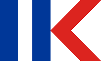 The vertical blue and white stripes represent the canal network of the city. The red chevron serves as an arrow pointing forward, which is customarily towards the hoist in vexillography, to mirror the civic motto of Birmingham as well as its tradition as a leading centre for scientific, industrial, cultural and economic progress. It can also be interpreted as an abstract heart to denote the city’s position in the nation as well as abstract lock gates to further the canal symbolism. Together the vertical stripes and the hoist-ward chevron act as an abstract representation of the '1K' Birmingham's sobriquet as 'the City of a thousand trades'.
F
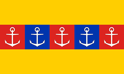 The series of checks running as a ribbon through the design serves to represent the different communities that come together as the fabric of the city. Upon each is placed an anchor which is the symbol of the Jewellery Quarter. This represents the wealth and quality the city is known for which is mirrored in the golden background to the design. The blue and red colours are drawn from the heraldic colours of the de Birmingham family and city council.
 Poll
Poll